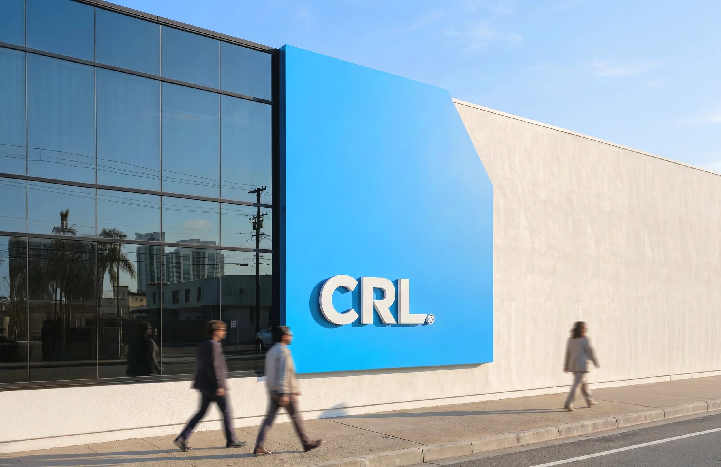

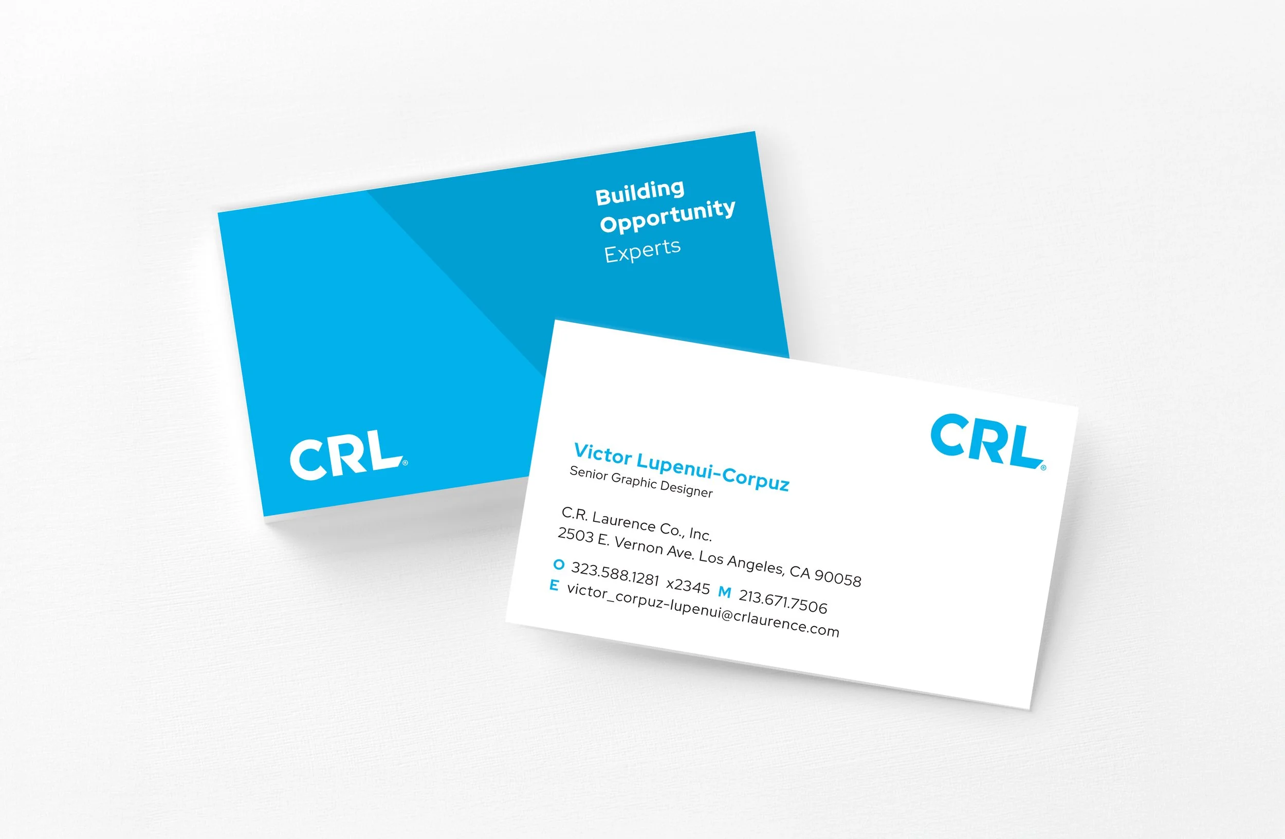


Challenge
CRL required a brand refresh and a cohesive brand system that could scale across a wide range of applications from print and environmental graphics to large-format signage, while maintaining consistency, longevity, and a premium presence. A secondary challenge was integrating an existing brand pattern, developed by an external agency, in a way that felt purposeful rather than decorative.
Design Approach
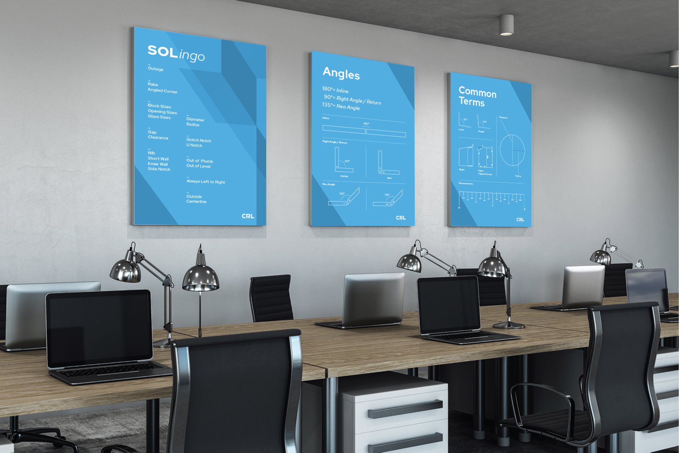
The brand pattern was derived from a 35° angle found within the CRL letterforms and was intended to provide visual ownership and flexibility across communications. My approach was to interpret this pattern with restraint, using it as a structural design element rather than a purely decorative one. Depending on the project, portions of the pattern were modified, layered, or removed to support hierarchy, clarity, and intent—ensuring each application felt considered, functional, and aligned with CRL’s premium positioning.
Note: Applications shown here were conceptual explorations developed to demonstrate the flexibility and scalability of the brand system. Final production decisions varied by project.